4 Hacks to Choose a Color Palette: You can save $$
Are you trying to redecorate one room in your house? Or you just moved into a new place and you’re trying to decide where to begin? Before you do anything, make sure you choose your colors.
Choosing your color palette might seem like something only designers do, but anyone CAN do it and everyone SHOULD. An intentional color palette makes your space look more like a designer designed it, even if all the colors are neutrals.
In design school, they teach all kinds of complicated color schemes, complimentary, analogous, blah, blah. You don’t need that to have a color palette that works. What you need is an inspiration piece.
4 Sources/Hacks for Picking A Color Palette
Want help choosing your color palette? Add a comment and send me an inspirational picture and I’ll send you your palette.
Fabric
The cheat that I learned in design school is to use FABRIC to set your color scheme. This doesn’t mean that your room has to be filled with the fabric that you choose—quite the opposite.


The fabric is designed and it already has colors that go together well. For this reason, it’s a straightforward way to steal/borrow the palette if it’s a fabric you love. Here’s an example of a color palette determined by the fabric.

You can use the fabric that inspires your color palette in drapes or curtains, pillows, upholstery, a lampshade cover or even frame the fabric.
Artwork
Same idea as with fabric. If you love a piece of art it can often inspire the entire room. This was the case for this bedroom makeover.
Artists are trained to work with colors. That’s one reason that using artwork is a safe way to


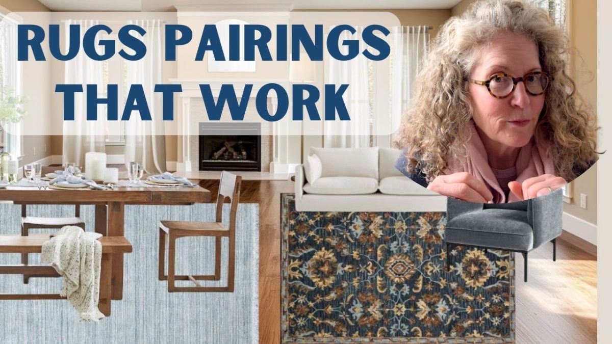
Rugs
Rugs can make a bold statement and they can also be the inspiration for your color palette. Here’s an example of a color palette using an oriental rug.


Pin Image
This hack uses a little bit of the computer to help. Here’s how it works and a few examples. First, choose a pin that you really like the colors. It doesn’t matter what room it is.
For example, here are two bedrooms. One has a lot of color and the other is neutral. Canva helped me to see the color scheme of both.


Next, open up Canva and create a new design. Upload the pin image or image from anywhere on the web into your design. Choose “add element”, I like to use a circle. Then up in the menu click on the color changer. As soon as you see this Canva will show you the colors in the room. These are your colors. You can see instructions for how to do this in this video.
Is Your Floor Part of Your Color Scheme?
You might not have considered your flooring as part of your color palette, but you DO consider the walls. Your flooring IS part of your colors.
Flooring can have a very warm tone (think honey colored wood floors) or a very cool tone (marble floor). It’s important to ensure your flooring works with your color scheme.
Warm Vs Cool Colors
Warm colors, shades of red, yellow and orange can make a room feel cozier. Cool colors, shades of blue, green and purple, tend to make a room feel more peaceful and calm.
Using BOTH warm and cool colors can make your room feel more balanced. The chances are that if you use one of the hacks above, your color palette already has a combination of these.
If you liked this post you might be interested in Tips for Choosing Interior Paint Colors or How to Choose the Perfect Shade of Green. You can also see the next step once you know your colors, how to use them in your room. If you can’t decide where to start decorating, check out this post.


I just discovered you through the blog, Life at Terra Bella. I would like to subscribe to your blog, but am unable to find a place to sign up. Could you help me with this, please? Thank you for your time and consideration,
Susan,
I can add you manually to the list. So glad you found me.
Andrea
Please add me to your blog.
Sure. I’ll add you to my weekly email list. Thanks for stopping by.