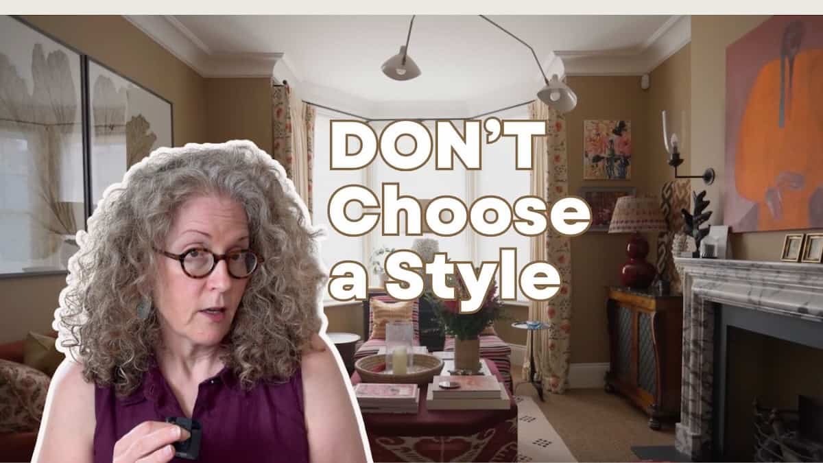
Don’t Choose a Style – Create Your Color Story Instead
Here’s what design school and the internet do not teach you. They want you to think that there is this magic style that is right for you, and you just need to figure out what that is. But if you’re having a hard time figuring out what your style is, forget about that because you DON’T have to choose a style.
Click to watch.
The Social Media Style Myth
Something that social media decided was a thing is that you have to choose one style. You have to decide. I’m coastal, I’m cottage or I’m traditional.
They don’t even teach these styles in design school – this is something made up by social media. They only teach Traditional, Modern and Transitional. So if you’re having a hard time deciding what your style is, don’t do that. Do this instead.
Focus on Your Color Palette Instead
Focus instead on your color palette. Because even if you choose a style, let’s say you choose cottage, your room can look kind of boring if everything in it is cottage. That’s one thing you’ll see when you look at designer’s homes, and we’re going to look at a few examples today of both designer’s homes and some mood boards where there’s a mix of styles.
You’ll notice that when a designer’s home is coastal, they’re going to throw in a modern chair. Or if their home is traditional, they’re going to throw in some really eclectic wall covering. They don’t limit themselves to a specific style. Instead, what they try to focus on is more of a cohesive color palette.
You don’t even have to have everything in the room match your color palette. But if you pick a color palette and try to get most of the things in the room to work within that color palette, it tends to make your room look more pulled together. So if you’re struggling with style, focus on color instead.
The 60-30-10 Color Rule in Action
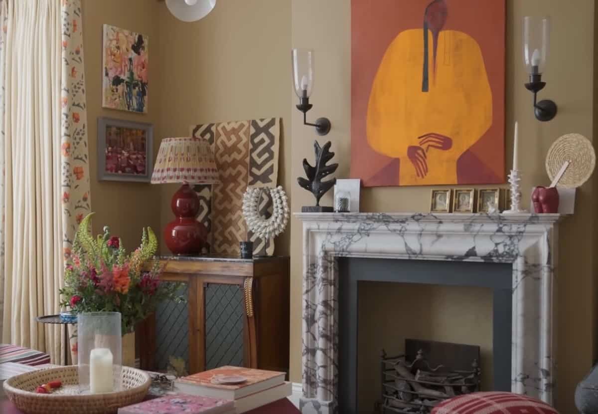
Here’s an example. In this first room, most of the furnishings are neutral, but to make the room work, we picked out some pinks and reds to pull the color palette together. We used those in a couple of different places, like on the upholstery for the bench, in some artwork, and in some pillows. Some of these things may be modern, some of them might lean toward traditional.
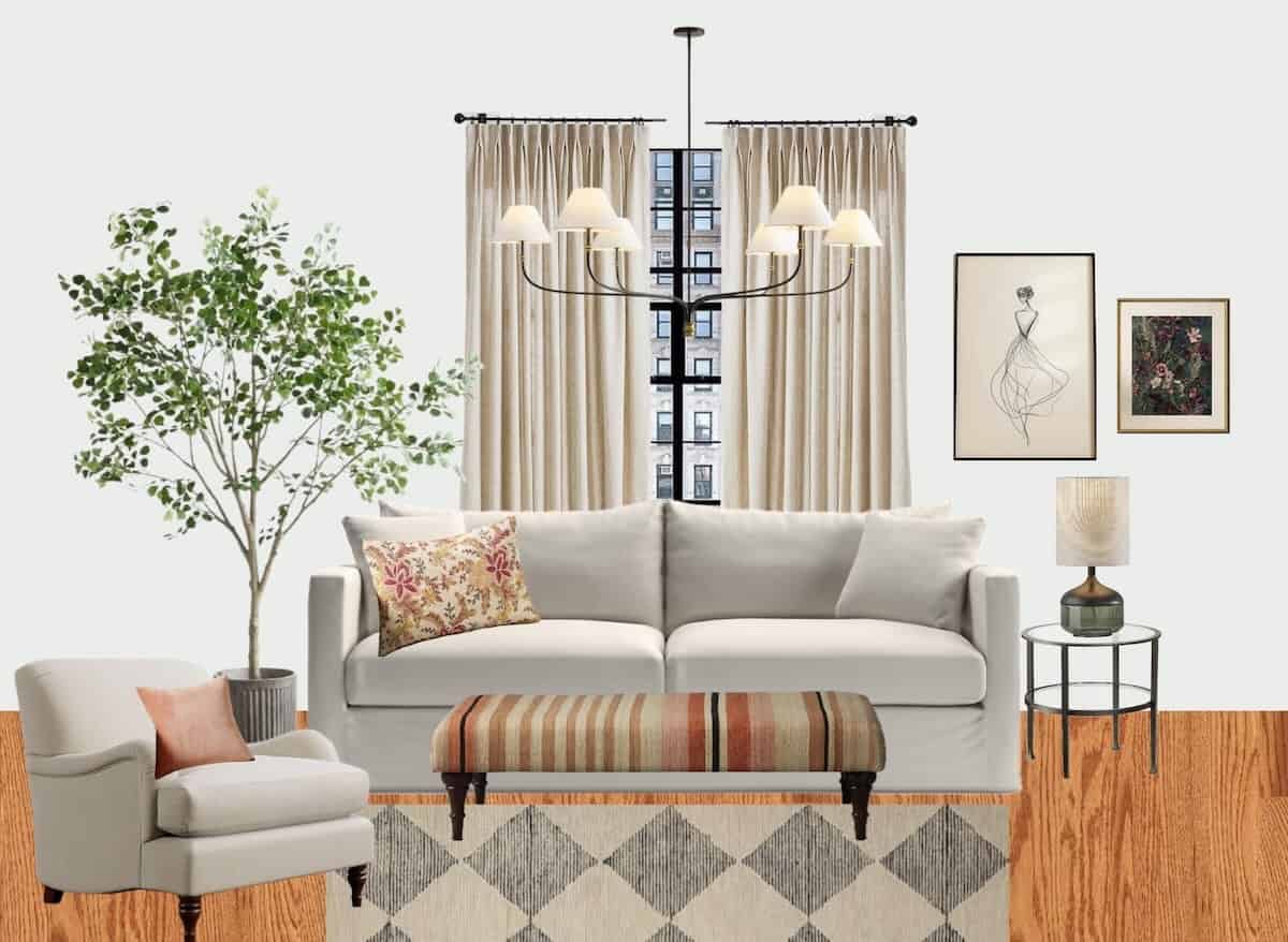
It doesn’t necessarily matter that the items themselves are a specific style that’s all the same. It’s that they work together in the color palette. I’ve talked before about the 60-30-10 principle, and that is that your eye will see about 60% one color, then 30% should be another color, and 10% should be a smaller accent color.
In this room, the 60% is probably cream, the 30% is pinks and reds, and the 10% is black.
Mixing Styles Successfully Through Color
This room has a mix of styles – some of it is modern and some of it is a little bit more traditional. The armchair has a more traditional look, but the coffee table is more of a modern aesthetic.
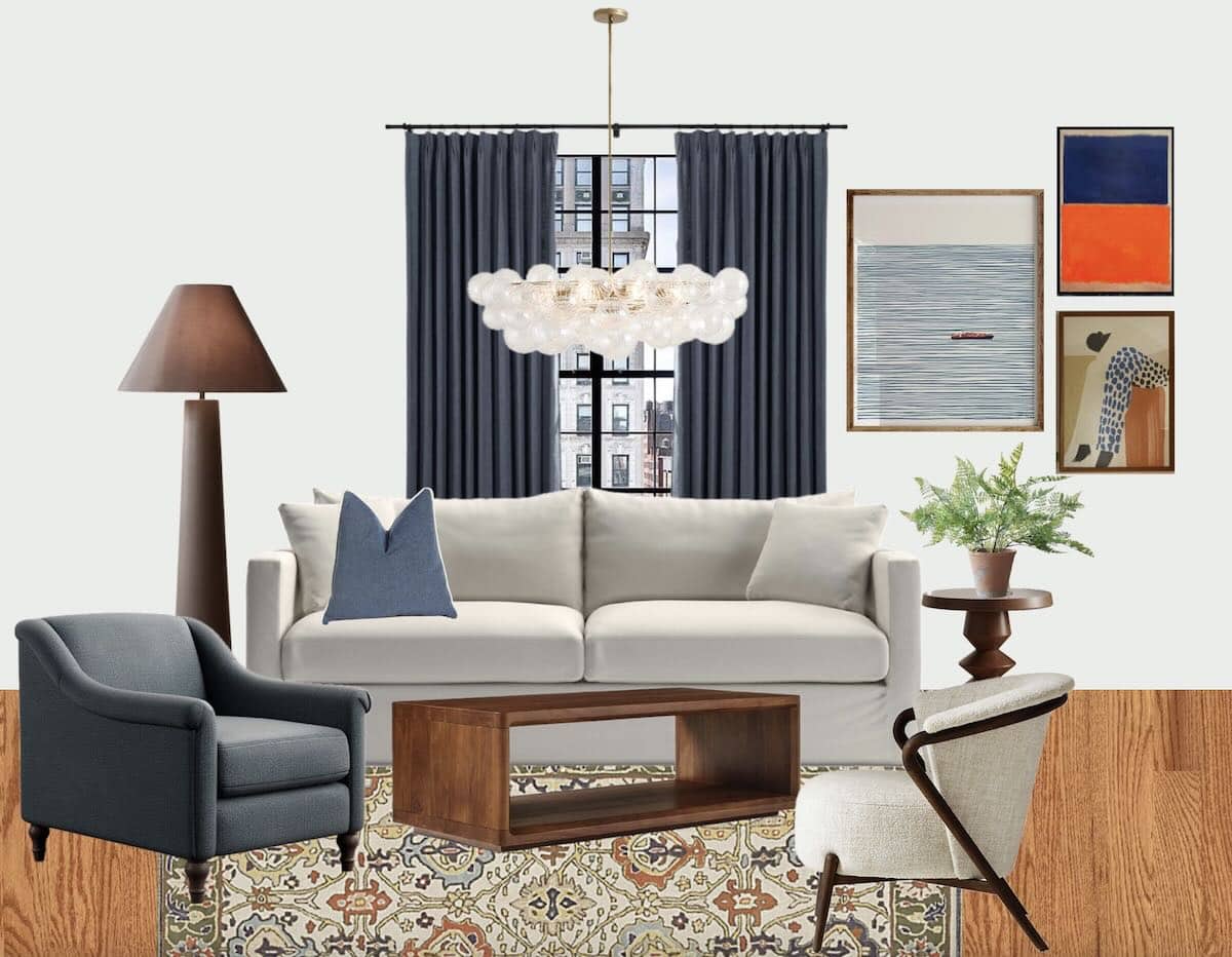
What makes the pieces work together is that they are in a similar color palette. In this case, following the 60-30-10 rule, 60% is a neutral oatmeal color, about 30% is blues, and 10% is a little bit of orange. You can see there’s a mix of styles within this room, but they work together because of the color palette.
In this particular case, what ties all the colors together – which is something I really love to use – is a rug. The rug has all of the colors in the color palette, and it makes it easy to pull out colors to use them throughout the room.
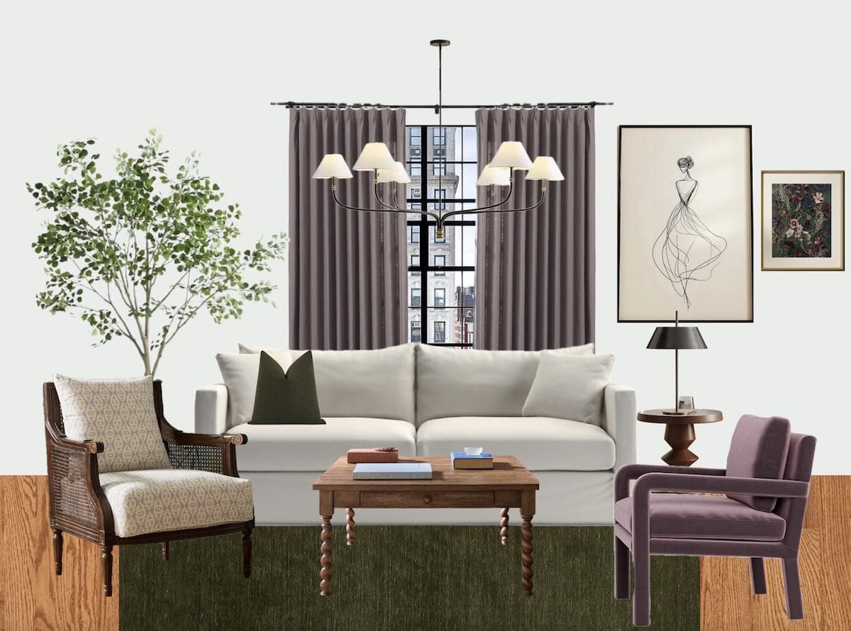
Here’s another example with some of the same furniture, but this person decided they wanted a little bit of cottage flair. In this case, we decided to use greens and purples together in the room. The armchair has a really cottage look to it, but we’ve pulled in accent colors of purple and oatmeal. The 60% in this room is again a neutral oatmeal color, but the 30% and 10% are the green and purple. The style of the items in the room is a mix of styles.
Real Designer Homes: How They Actually Live
Now, let’s take a look at some designer’s homes where they embrace this approach. This first one is kind of a coastal room, and these are from some of the Schumacher home tours. These homes are worth taking a look at. Schumacher is a well-known fabric manufacturer, and their fabrics are gorgeous and really pricey, but they know how to combine colors.
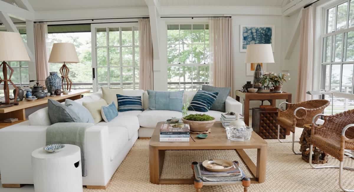
This home has a coastal look, but you can see there are some really modern elements in this room, like the chairs with the chrome arms. That’s a really modern touch, and there are some really modern lamps. So it’s a mix of coastal with a little bit of modern, but what makes the room really work together is the layering of the color palette.
A Designer Who Masters Color Layering
Here’s another example, and this designer uses a lot of color. The first example shows just how much color she uses in the room. They’re such a mix of styles, but they really work together because she’s intentionally using the colors. She’s using lots of oranges and reds.
The artwork is really modern, but some of the lighting is more cottage looking, and it’s all pulled together. You can see in this little vignette that the colors are really coming from the fabric on the drapes. She’s pulled together these oranges and reds and touches of black that are in the fabric trim.
In this little vignette, there’s a really modern looking sculptural piece, a cottage-style lamp, and a modern, geometric piece of art. So not everything in this space is just one style. It’s lots of styles mixed, and that’s what makes a space more interesting.
Here’s an overall view of the room, and it really has a lot of neutral in it too. The 60% in this room is probably camel, and then the orange and the pinks and reds are the other two colors that are brought in as accents. In this case, I think she’s using the fabric to really drive the color palette, which is one of the tricks you can use – something like a piece of art.
Use What You Love to Drive Your Color Palette
A rug or fabric can really set the color palette for your room. It’s an easy way to do it if you have one of those things that you really love. Let’s say you have a painting that you just love. You don’t know what it is about the painting, but you love it. You can use the colors in the painting to drive the color scheme for your room, or you can use the colors in a rug that you really love to drive the room.
That is one of the easiest things to do.
Start Shopping for Your Color Story
I’m hoping that this will make it easier for you to forget about choosing a style and instead focus on choosing what your color story is. That makes it so much easier when you go out shopping or on a trip to find something that will work in your home. If you know the color palette, you can say, “Ooh, look at this pretty blue blanket. Wouldn’t this work in my living room? Because I know my living room has got a lot of blue in it.”
So stop shopping for your style and start shopping for your color story. You might find it’s a lot easier to pull your room together.