Forget Color Theory: What designers don’t want you to know
Do you ever wonder why some homes you walk into feel pulled together, warm, cozy, and inviting? But, other homes don’t have that feeling?
Some of the cohesive feeling has to do with the color palette. I’m going to teach you a few easy rules about color theory.
At the end of this article, I have a surprise that might be a little shocking.
I’m going to tell you why you should throw out all these rules about color theory. You don’t need to learn them anyway.
Designers like to make color sound a lot more complicated than it is. I’m going to give you a few basic terms to get started.
Hue just means color.
Tint is when you take the hue and you add a little bit of white to it.
Tone is when you take the color and you add a little bit of gray to it.
Shade is when you take the color and add a little bit of black to it.

There are three main kinds of color palettes that you can make for any room.
1. Monochromatic Color Palette
The first one is going to be a monochromatic color. This means all the colors in the room are pretty much one color. Different textures may have a different sheen. But, they’re pretty much the same color.

This doesn’t only happen in a neutral room. Here’s an example of a neutral room that’s monochromatic.

Here’s an example of a colorful room that is different shades of green.

2. Complementary Color Palette
The second kind of color palette is called the complementary color palette. This means using two colors that are on opposite sides of the color wheel.

That could be a blue and an orange like this room, or a red and a green, or any color on the color wheel. You are using complementary colors as long as you use one color from the cool side and one from the warm side.

3. Analogous Color Palette
The third kind of color palette is called analogous. This means using three different colors that are on the same side of a color palette.

Here is an example of a room that is blue, violet, and purple.

You could use any colors, as long as you’re picking three that are close together.
Design Tip: Setting a Color Palette
Here is the shocking part. Why am I going to tell you that you don’t need to know about color theory?
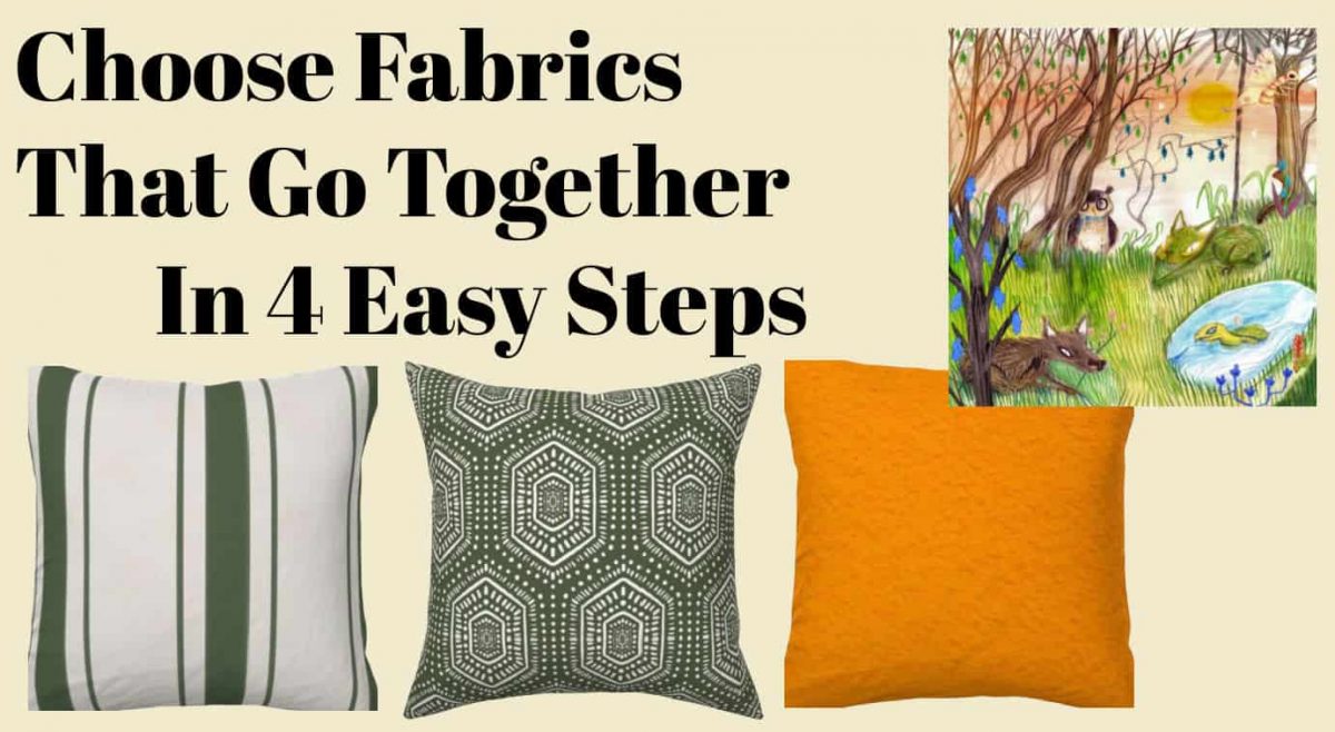
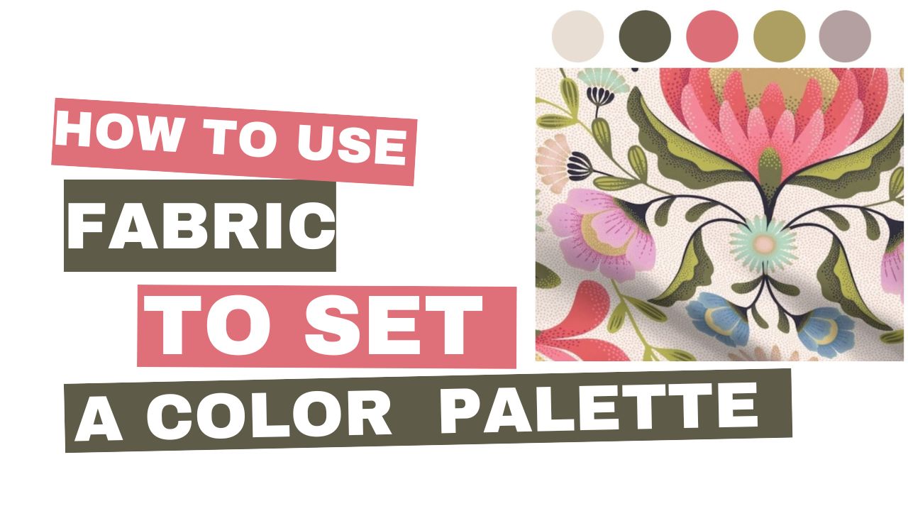
The color wheel is overwhelming to start with if you’re trying to decorate. The easiest thing to do is pick something that inspires you, like a fabric, wallpaper, or rug.
The reason you don’t need color theory is the fabric you’re using, or the rug you’re using already has a mix of colors in it that someone who knows a lot about color theory has designed.
Keep in mind that the designer is making a thousand yards of the fabric, They’ve already picked out colors that go together. All you have to do is pick out a piece of fabric that you love and use that to build your room’s color palette. Leave the color theory out of it.
If you’re interested in more color shortcuts, I’ve got another article about four hacks to set the color palette in any room.


