How Designers Actually Add Color to a Room
Are you tired of your neutral room, but you can’t quite decide how to add color to your space? I’ve got two examples of real clients, and I’m going to share their projects along with how we added color to their spaces in a way that fit with their very different style inspiration.
Example 1: A New York City Apartment That Went All In on Color
So, let’s start out with this New York City apartment. And this apartment had a little bit of color already because she owned a big orange sofa that she loved and wanted to incorporate into the style.
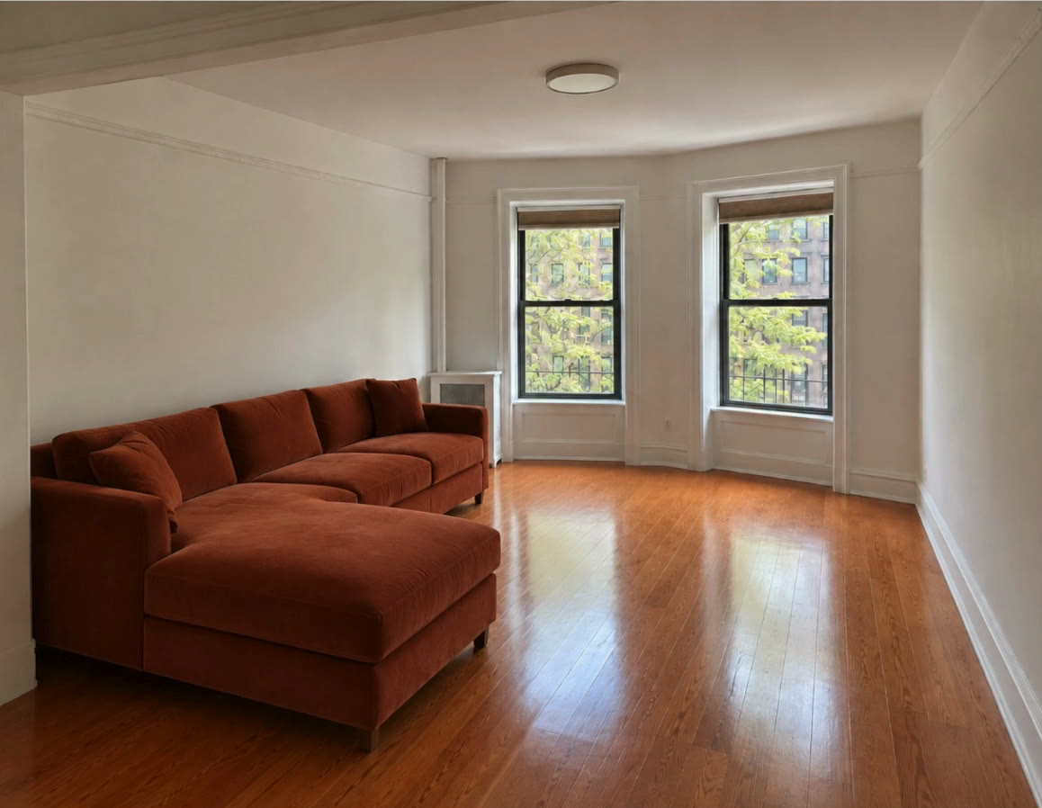
Inspiration vs. Reality
I want to share her inspiration. And when you look at this inspiration, I want you to see that it’s traditional. It is drenched with color. And there is a lot of architecture in these rooms doing a lot of the heavy lifting for why they look the way they do.
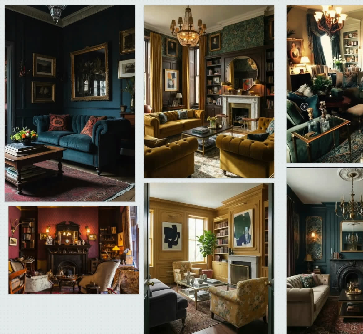
So that is something to consider. When you look at inspiration shots, you have to think about, can my room really look like that? I mean, we can get a lot of the elements in, but sometimes the architecture is not possible to replicate on a smaller budget. Now, let’s take a look at how we tried to bring her inspiration to life.
Start With the Rug
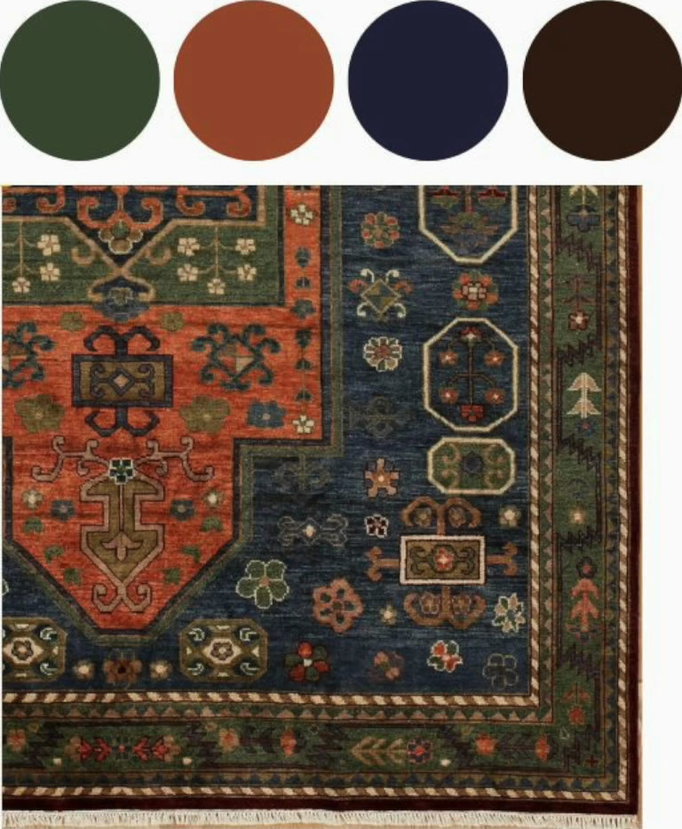
You know, I’m going to start with a rug because I think rugs are a great way to set the color palette. And if we want to bring in a lot of really rich, deep, dark colors and color drenching, the best place to start is with a rug, I think, because a rug, there’s the fewest number of choices, whereas paint, there’s an infinite number of choices.
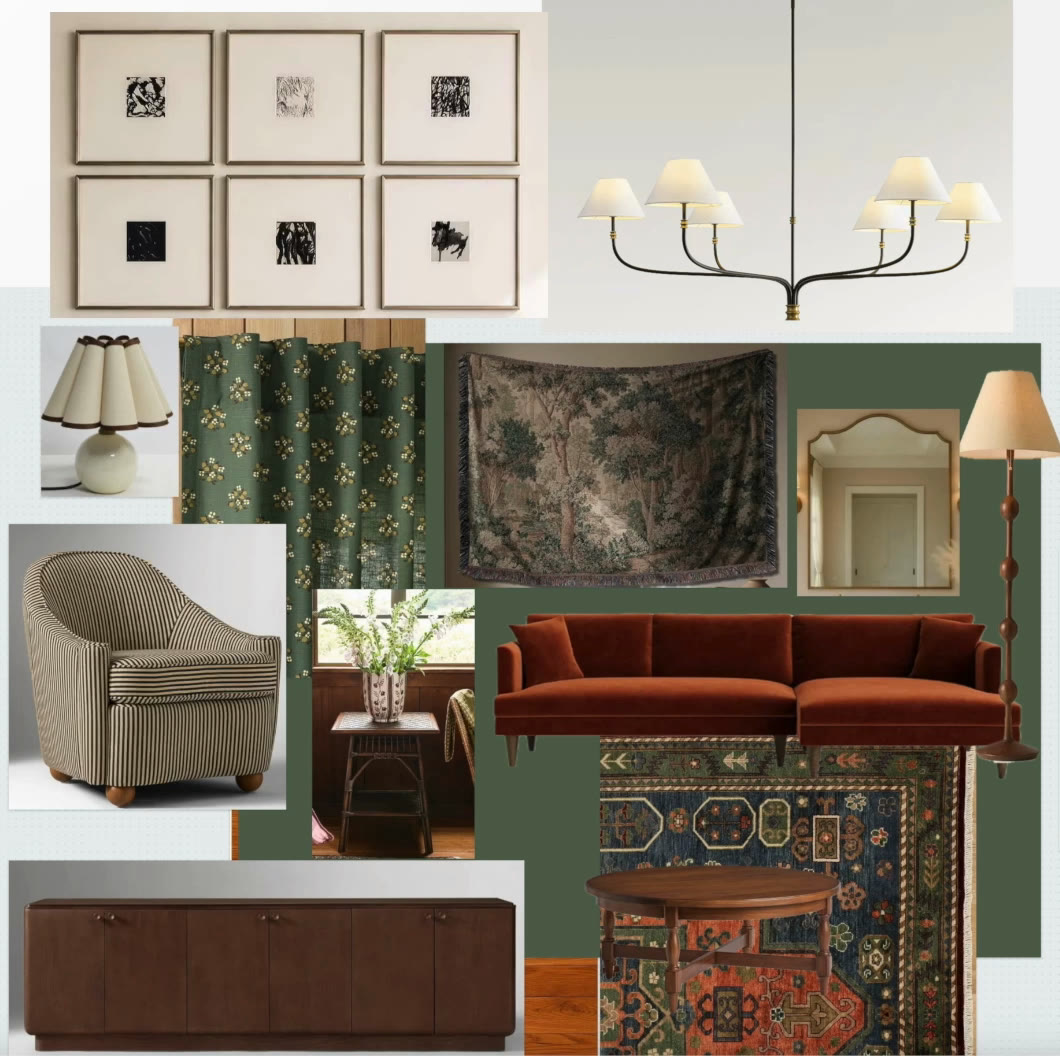
So, start with the rug. So, we wanted a rug that coordinated with this orange couch. And I think this rug is gorgeous with it. So, let’s start here. And this rug gives us a lot of colors to pull from.
So from there, we added a couple of chairs that had a little neutral stripe, a warm wood credenza, some really dark curtains because we want this space to feel really rich and dark, some lighting, a floor lamp, a lamp for the credenza, a mirror, and in this case, there was an interesting door between rooms that wasn’t being used in the space. So, we wanted to pick out a tapestry that could hang over the credenza to hide that.
So, in this room, they don’t need a TV. They use a laser projector. And we added a little rattan side table to kind of fit the style aesthetic.
Then Pick the Paint
So, what I want you to see about these foundational pieces, the rug, the credenza, the curtains, all the colors work together. And then we picked the paint color to really bring it home. And in this case, we picked a dark green.
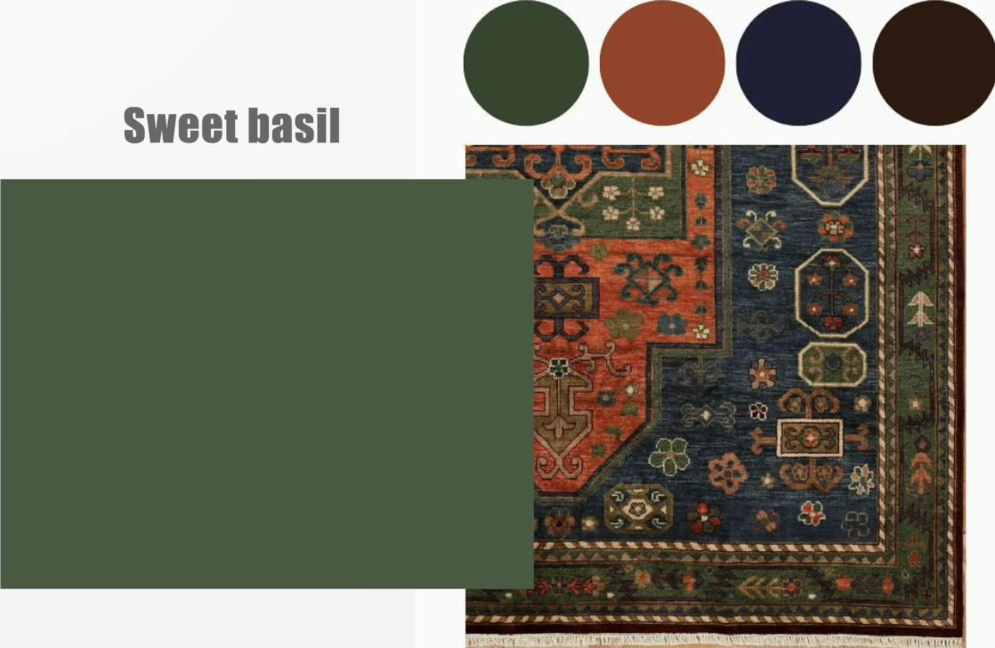
This is an example of going from not very much color to a lot of color. And the way to do that with intention and a plan and make it look intentional is to use a rug in this case and bring the colors in around the room that are in the rug.
Example 2: A Los Angeles House With the Color in the Furnishings
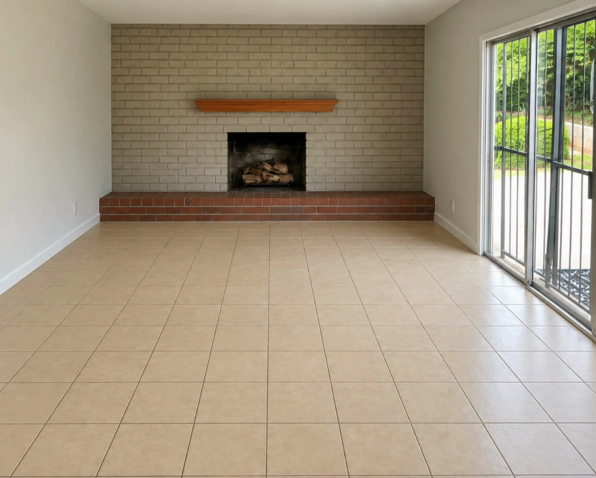
Let’s take a look at the second example, which is a Los Angeles house. And in this case, the room is really neutral. There are light colored tiles. The walls are white.
And her inspiration is one of my favorites, which is Rita Konig. And I might be mispronouncing that, but she likes to play with color in less overwhelming ways, but intentional ways, more of a whimsical style.
Let a Piece of Art Drive the Color Palette
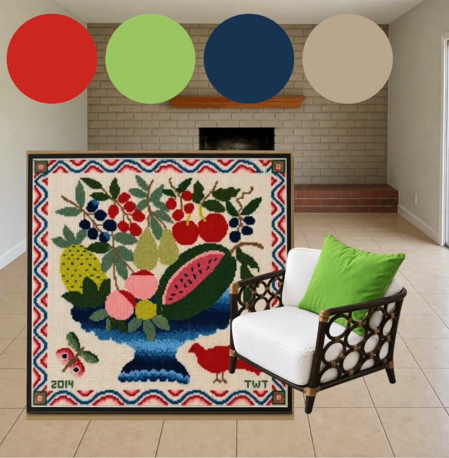
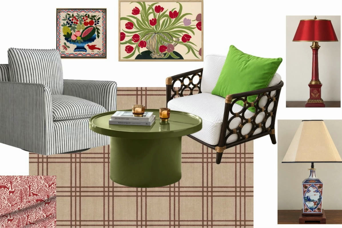
So, in this example, the way we’re going to bring in the color palette or drive the color palette is with a painting. I’m going to use a painting to draw the colors from.
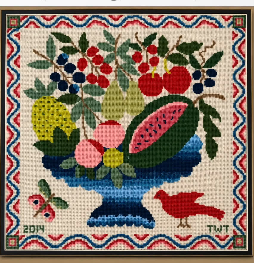
So, I knew that she liked lime green because she had these great rattan chairs with nice looking white cushions and some really great lime pillows. So, we already had one color to work with and I knew that she also liked red.
One Room, Two Purposes
The space needed to serve two purposes: both a living and conversation area, no TV, and an office area. So, she didn’t want to spend the money for a sofa because she had these two great chairs and it’s a lot more affordable to add two more chairs. And in a space like this where you don’t want to watch TV, a square furniture arrangement can be a really intimate seating choice.
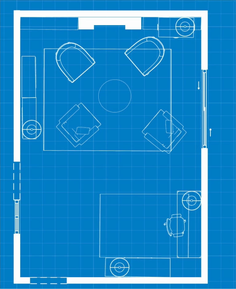
Two Rugs That Coordinate
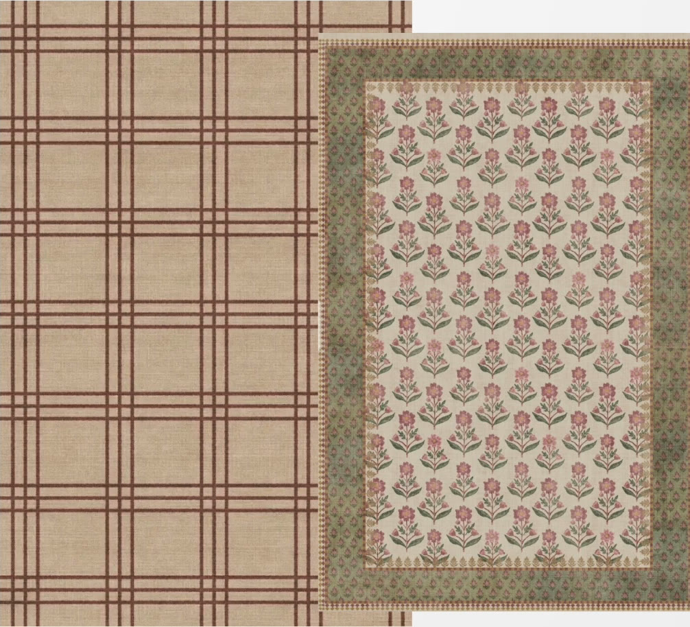
One thing I had to do in this room was to bring in two different rugs that coordinated. And I did another post where I talked about how to choose two rugs in a space that can work together but don’t match.
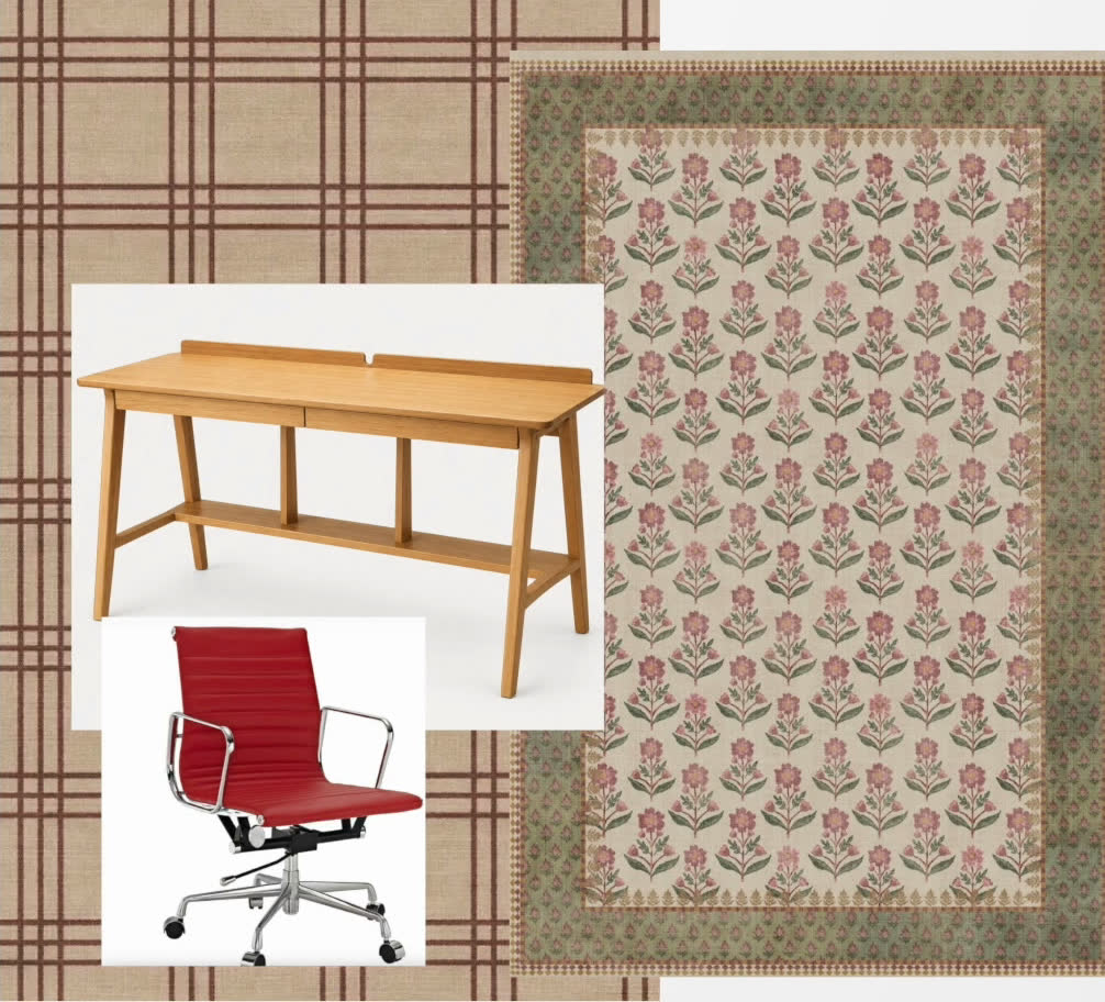
So in this case in the bigger living area, we brought in a rug that was mostly neutral with a little red plaid. But in the office area, we decided to pick a more fun rug that had a lot of pattern, red and green, and put that over in the area that’s going to be used for her office.
And we added a red office chair to kind of spice up the whole vibe of the office space. So, she also wanted to have a space for a lot of books.
Repeat the Colors Around the Room
And so we brought in touches of red with the rug with some upholstery for another piece that she plans to have recovered. So we chose these pretty affordable chairs to go in the seating area with the chairs that she already had. They are a blue and white stripe. The really fun way to pick up the lime was in this green coffee table.
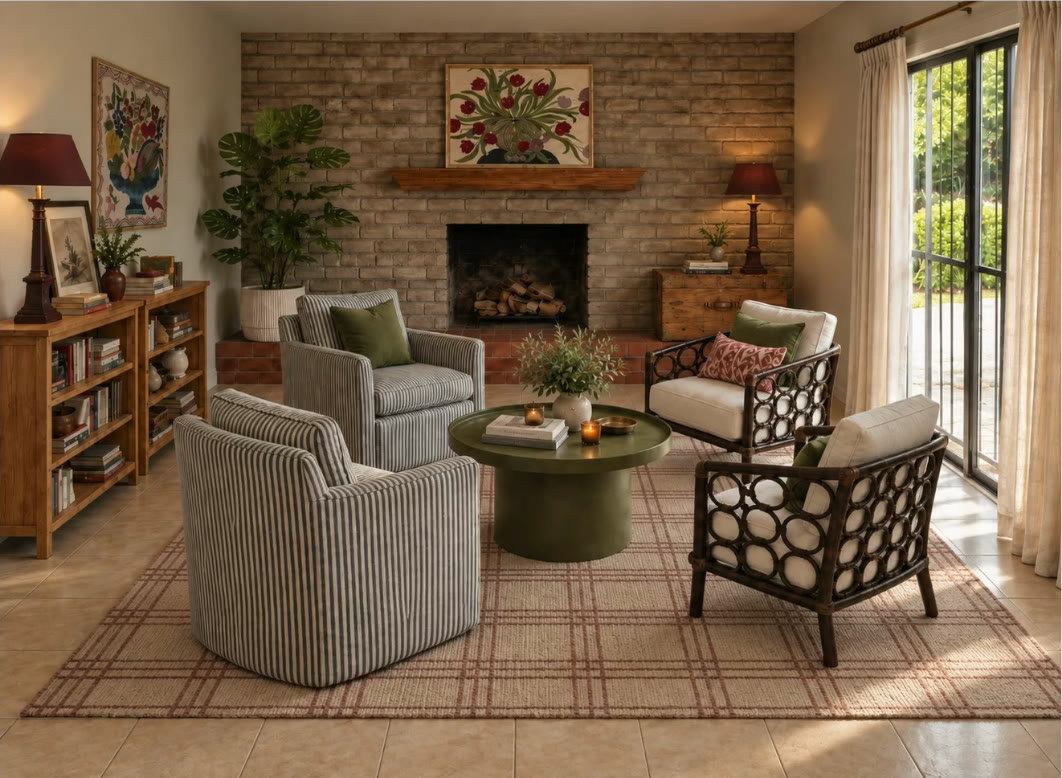
So you could see the artwork, the colors on the artwork are being repeated in the pillows, in the coffee table, in the upholstery fabric that we picked out for her other chair and in the rug.
Keep the Pieces You Already Have
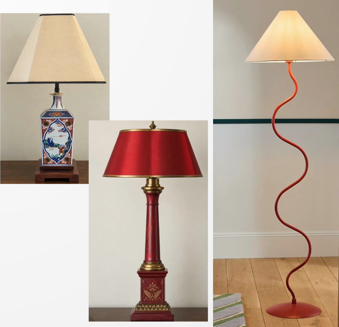
And she had some really great metal table lamps that we were able to keep and incorporate because they’re red and she had a really great red shelving unit that is in another part of the room. So, the little touches of red and green played throughout the room and are reinforced in the artwork and in this really great piece of needlepoint that she wanted to hang.
So, we did add some more lighting in addition to her red metal lamps, a red floor lamp. She had some other Asian inspired porcelain lamps that work in the room.
So, you can see it’s good to work with some of the pieces that you have if you can because it’s a great way to keep your budget down. And as long as you can make the color palette work together, the transformations don’t have to be that expensive.
Two Ways to Add Color With Intention
So, you could see it’s a completely different way of incorporating color, but still it feels intentional and the color palette is pulled throughout the room. And in this case, the color palette is driven by a piece of artwork that we can pull all those little touches from and add them all around the room.
So, if you’re interested in adding some more color to your space, but you’re not quite sure how to do it, check out how I can help. I work with people that find me here all the time.
Shop the Post
The links below are affiliate links, which means I earn a small commission if you buy through them. Prices were current at the time of writing.